Poster Designs
I started designing posters about 3 years ago for my school club when I got the premium version using my education mail. This opportunity introduced me to Canva and other design software.
Here is one of the first posters I made for my club :

Immediately, I could see a lot of problems with this design.
- It’s all cluttered, It’s really hard to navigate viewers’ eyes to the central idea.
- It is like the movie “Everything, Everywhere, All at Once” but without the Oscar-worthy performance.
- There are a lot of color and font variations used which is throwing off all the contrast.
- The logo placement is horrible.
- Overall this poster is a prime example of “How not to design a poster”. (Feel free to use it as an example fellow designers, I will be glad).
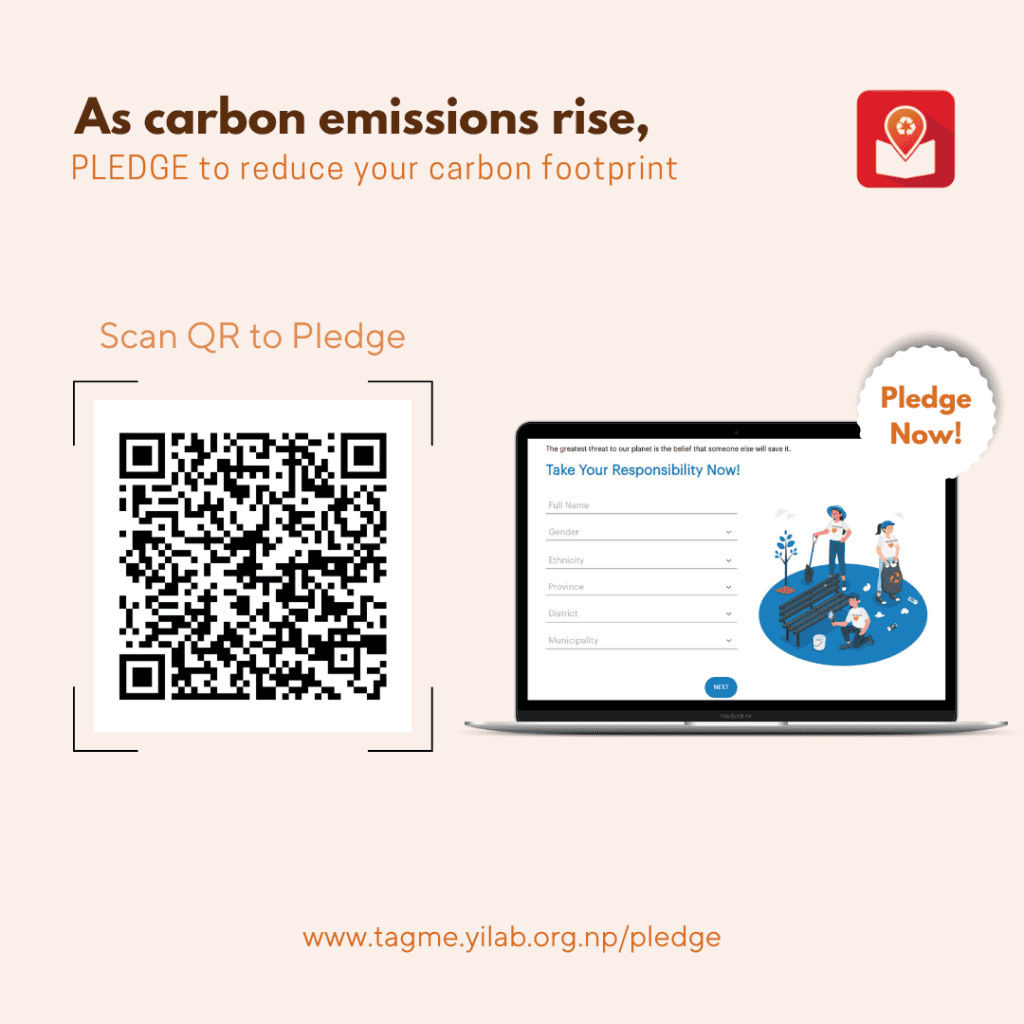
Moving on, this is one of the latest designs I made for a college:

You could see the stark difference in the quality of the poster.
Here’s why it’s better than the previous one:
- It is a clean, minimal poster with a good font selection and color pairing that was according to the brand color of the institution.
- The poster speaks for itself and an average viewer doesn’t have to waste a lot of their time finding the central idea.
Still, there will be a few things that could be improved (as design is an ever-evolving field so some relevant design practices today might not be relevant anymore in the future).
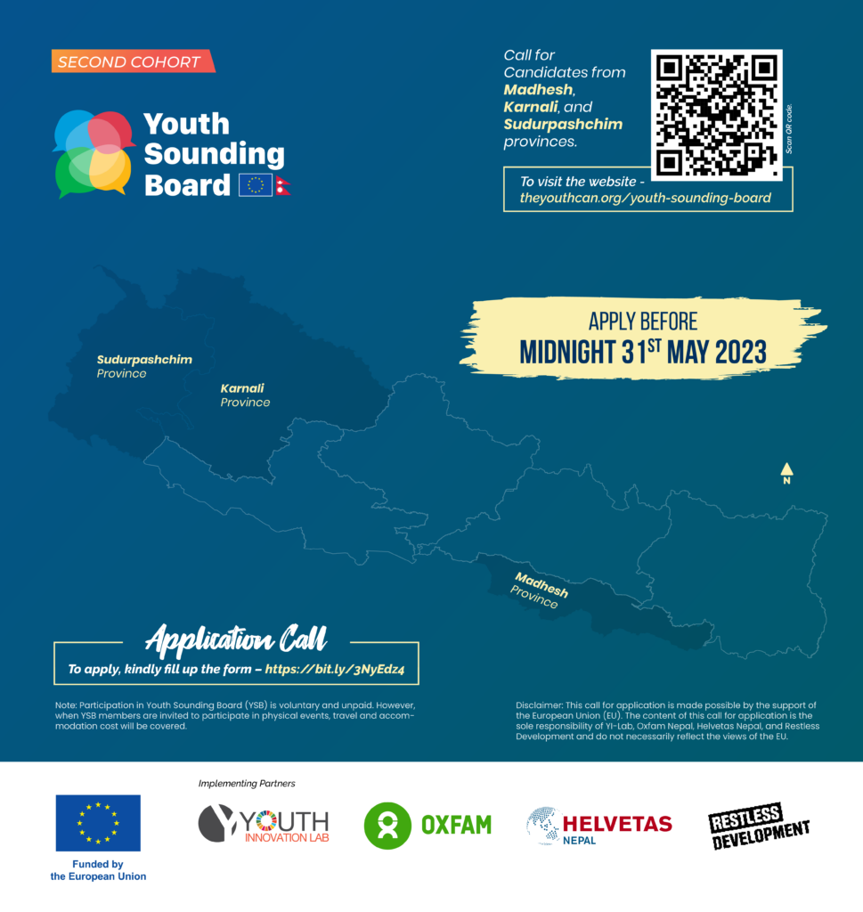
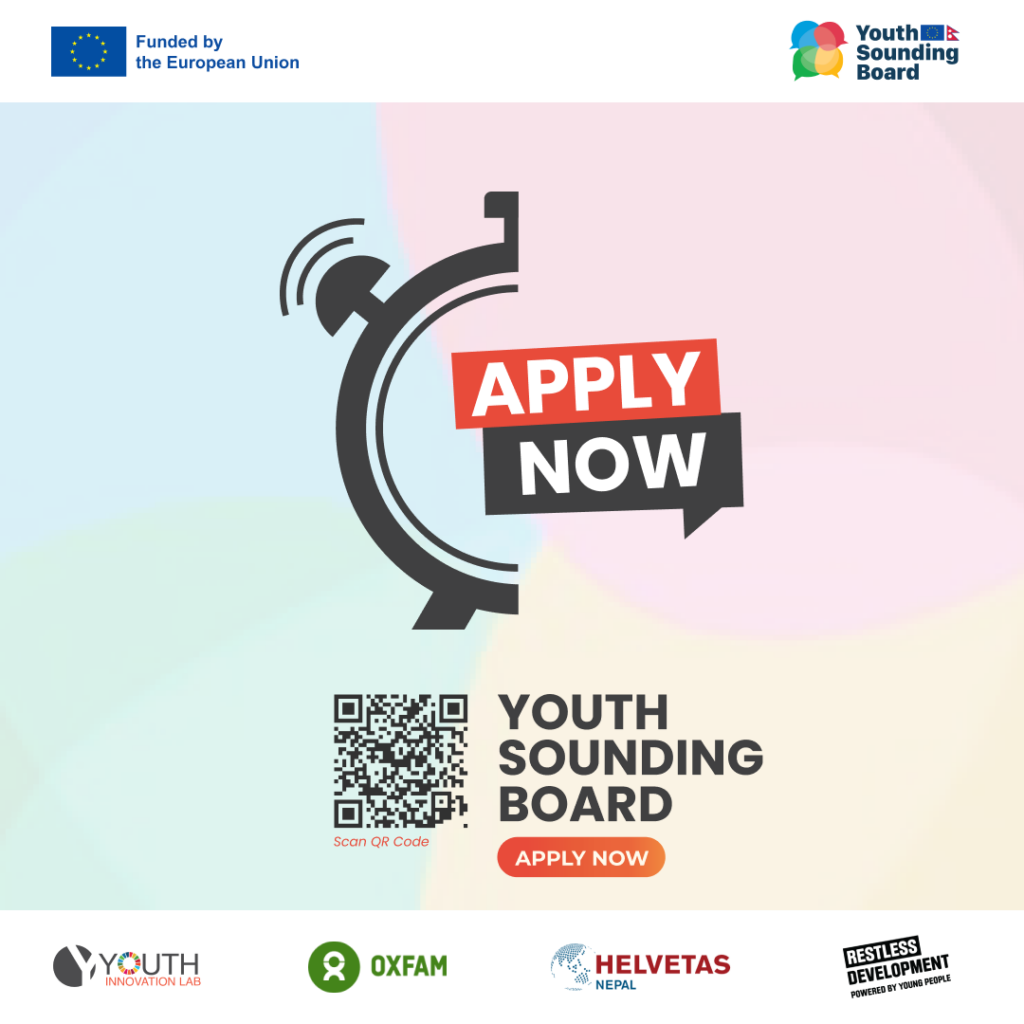
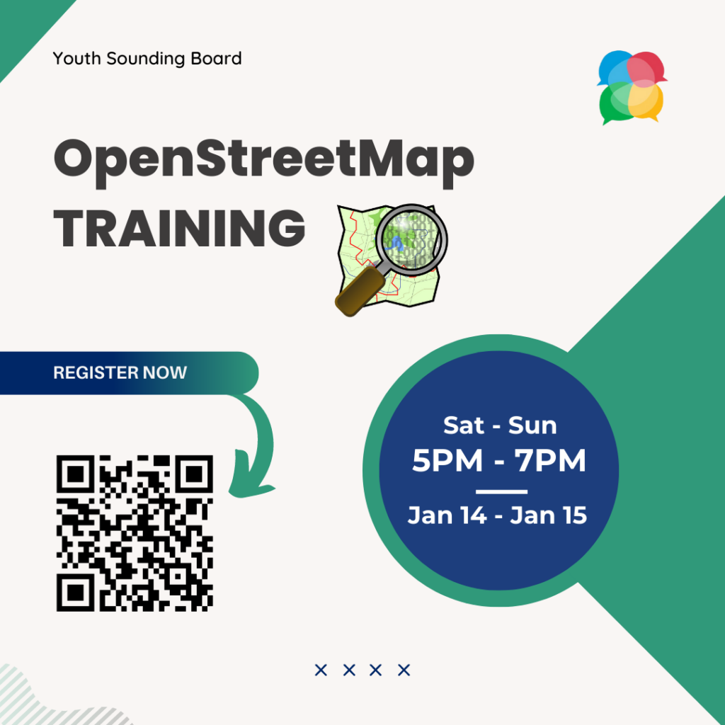
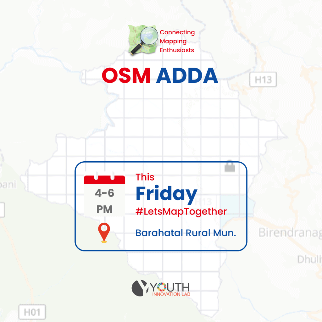
With that, I leave you with some of my best works over the years to see how my skills improved over time.
Enjoy 🙂

